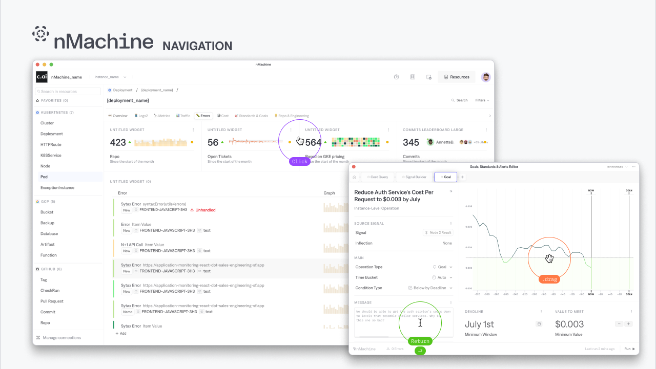
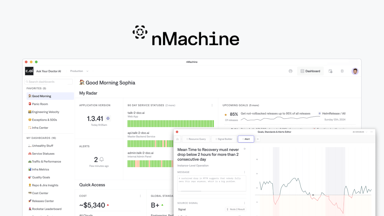
Project: nMachine App
Figma Library: nMachine Component Toolkit
React Library: Storybook
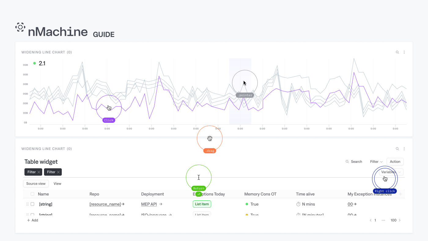
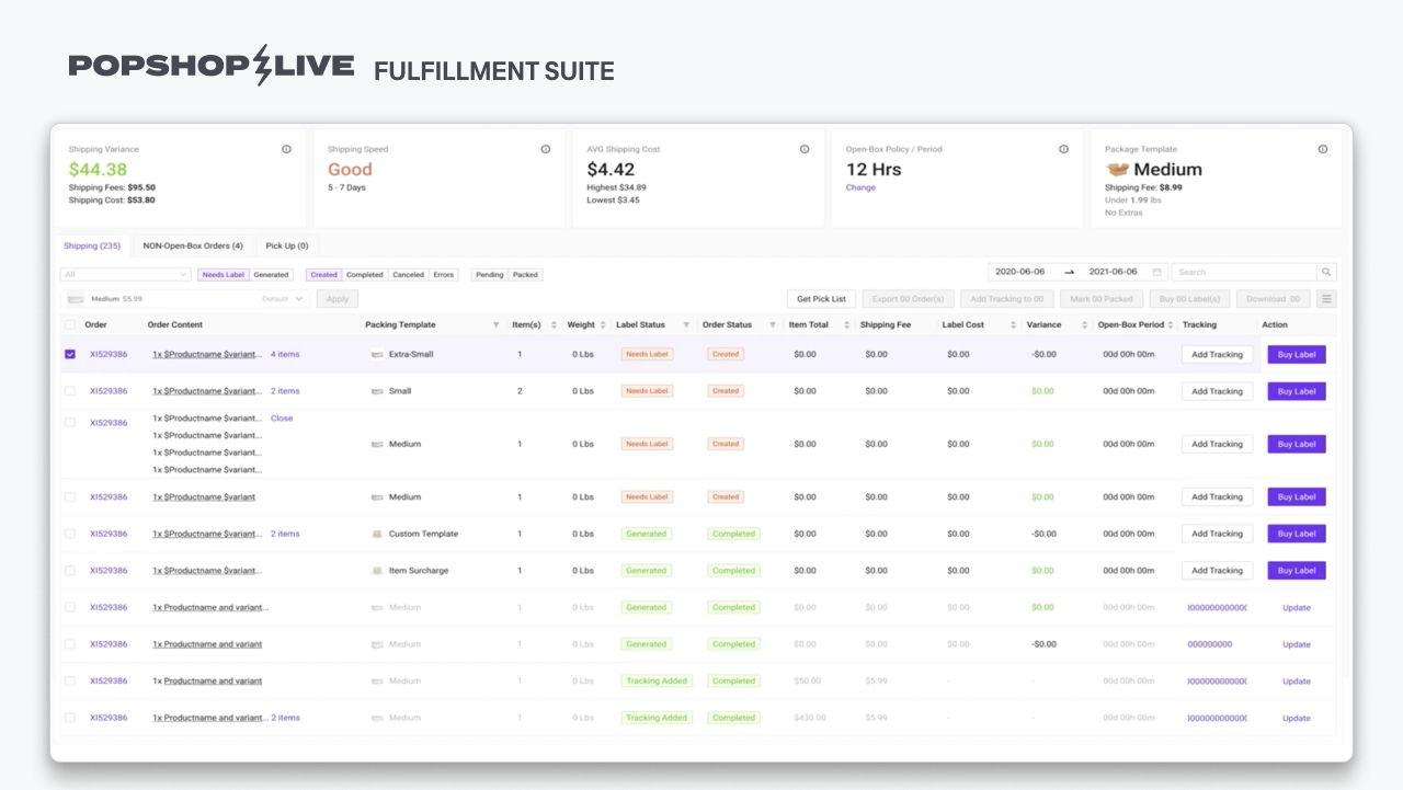
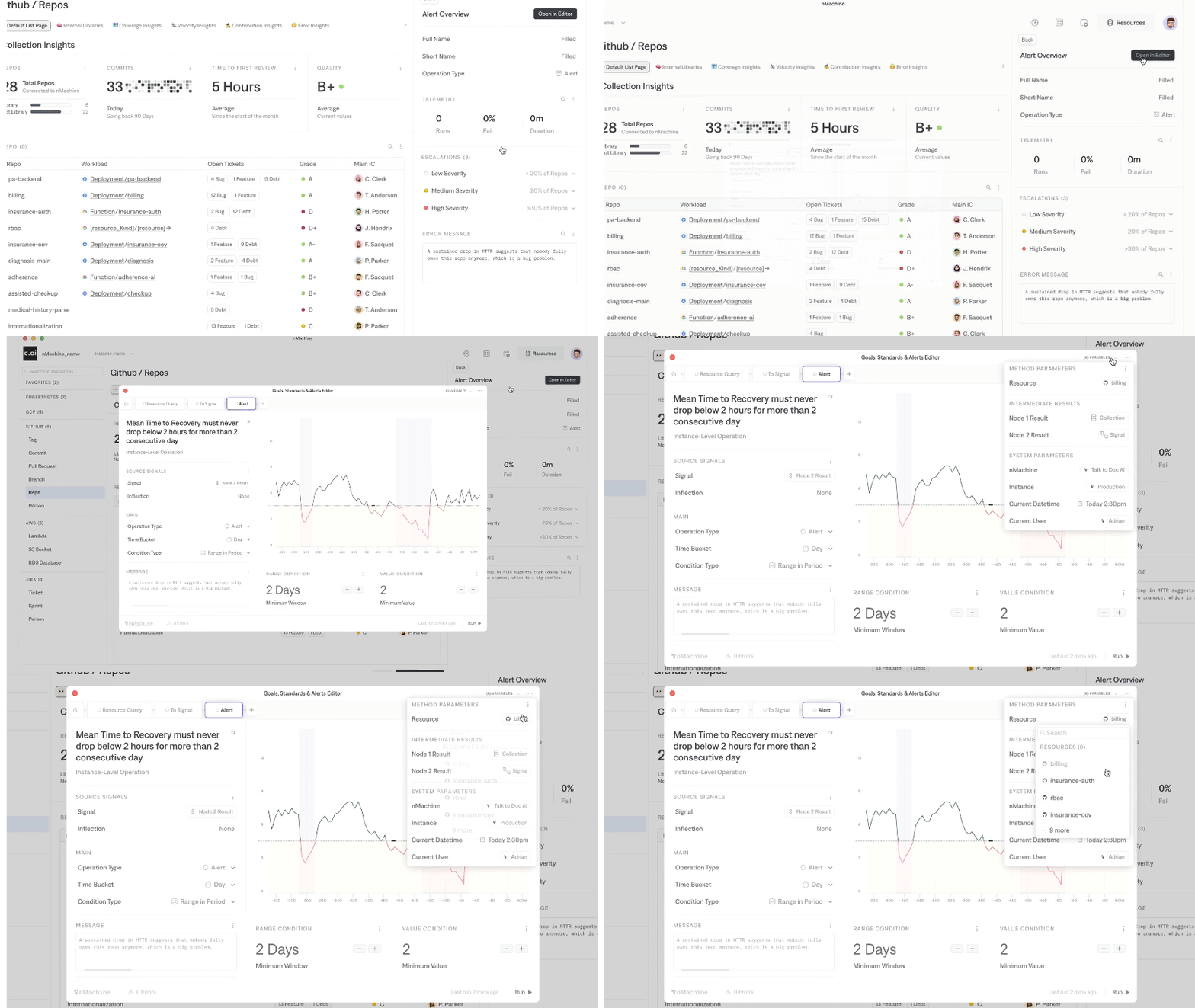
Our component library was designed to be simple and short in the amount of atoms with reusability as a priority. This enabled us to create full page templates and with very simple building-blocks and keeping document's core atoms static and only growing in their applications.
Easy to use
Keeping UI components simple made it easy to reuse in more complex components an ensures consistency across our designs.
Easy to adapt
Building components that can easily take on different colors schemes is crucial for further flexibility in the design. when restyling existing libraries having a plan for brand colors and data visualization palettes is key to fit complex components ( from off the shelf) into our product seamlessly.
Ready to use
So developers didn't have to wonder how components were supposed to work, we set up a Storybook page with our most used components to expedite the process.
This way anyone could start on a project without having to go through huge amounts of documentation.

