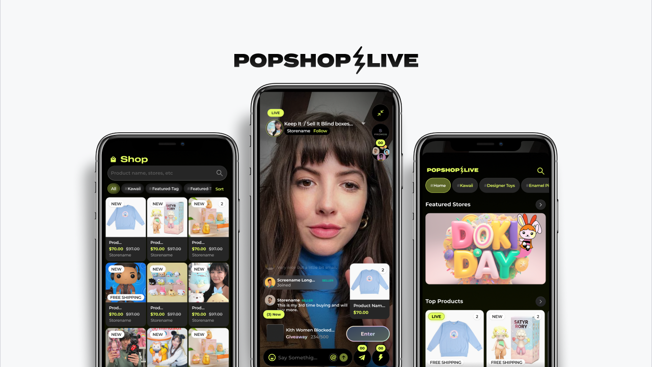
Livestream shopping had become really big in the Asia Pacific region since Taobao Live was introduced, and was rapidly gaining traction in the United States. Popshop was meant to introduce a marketplace where businesses and creators can host their own live shows and sell directly to their audience.
A lot of pieces to this puzzle but, what we knew ahead of time was the main requirements of product were in line with basic e-commerce, livestream, social media, so we needed to address them all, or the whole experience would lose its value.
First Draft (8/2018)
Our first draft consistent on quick access to the platform's shows. With some very important things to keep in mind:
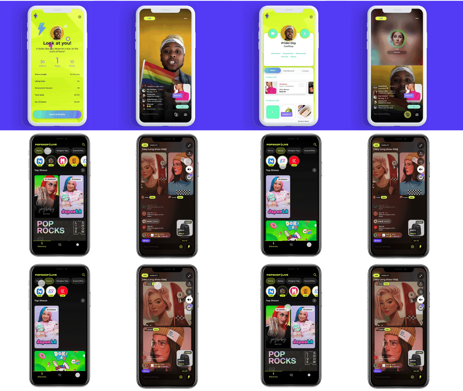
The focus of the experience was in the livestream, this is the arena where all the best of Popshop takes place. So we put a lot of thought into it. Instagram live, Periscope, Snap, had a very distinct design, so we needed a look to stand out among the rest.
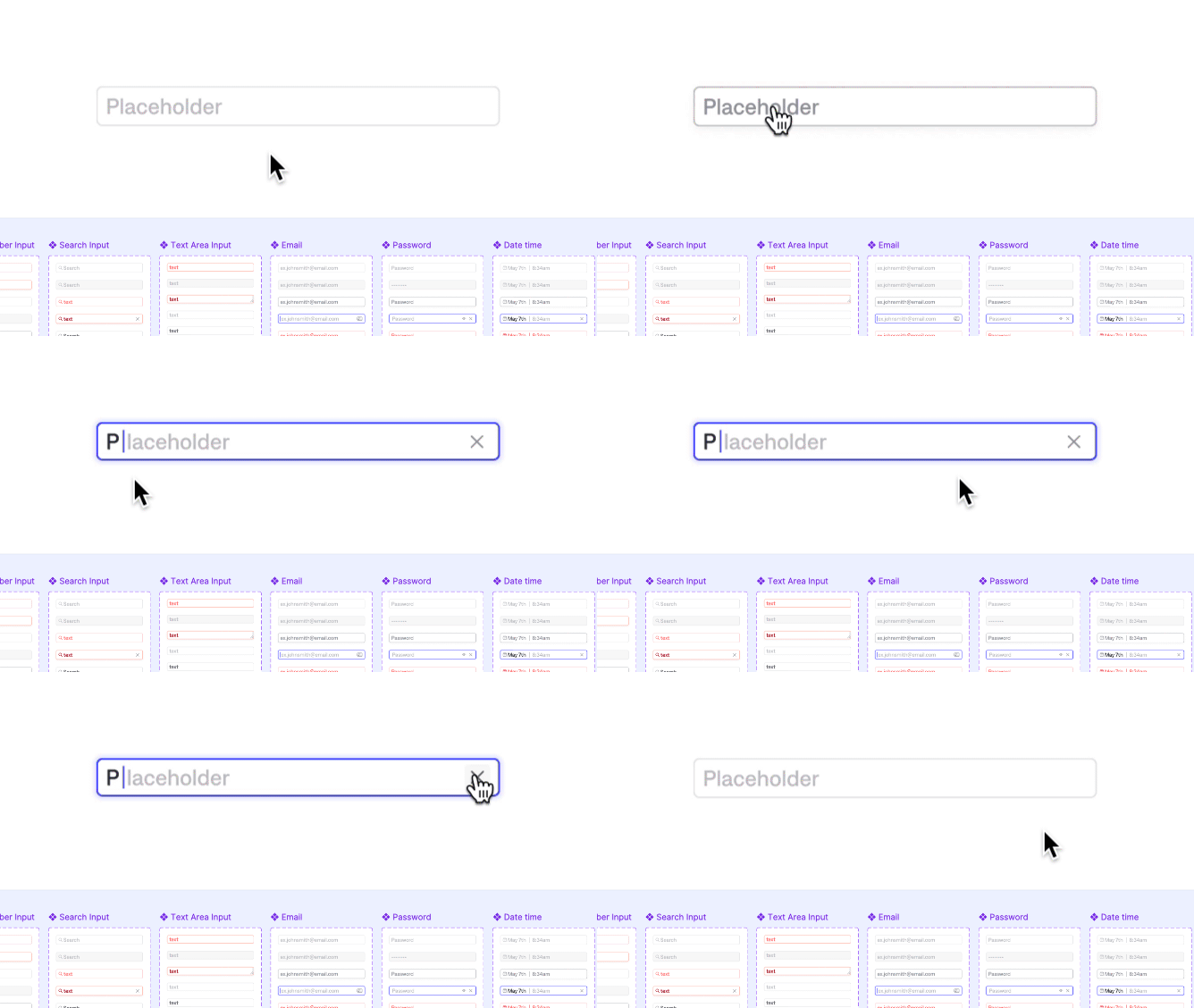
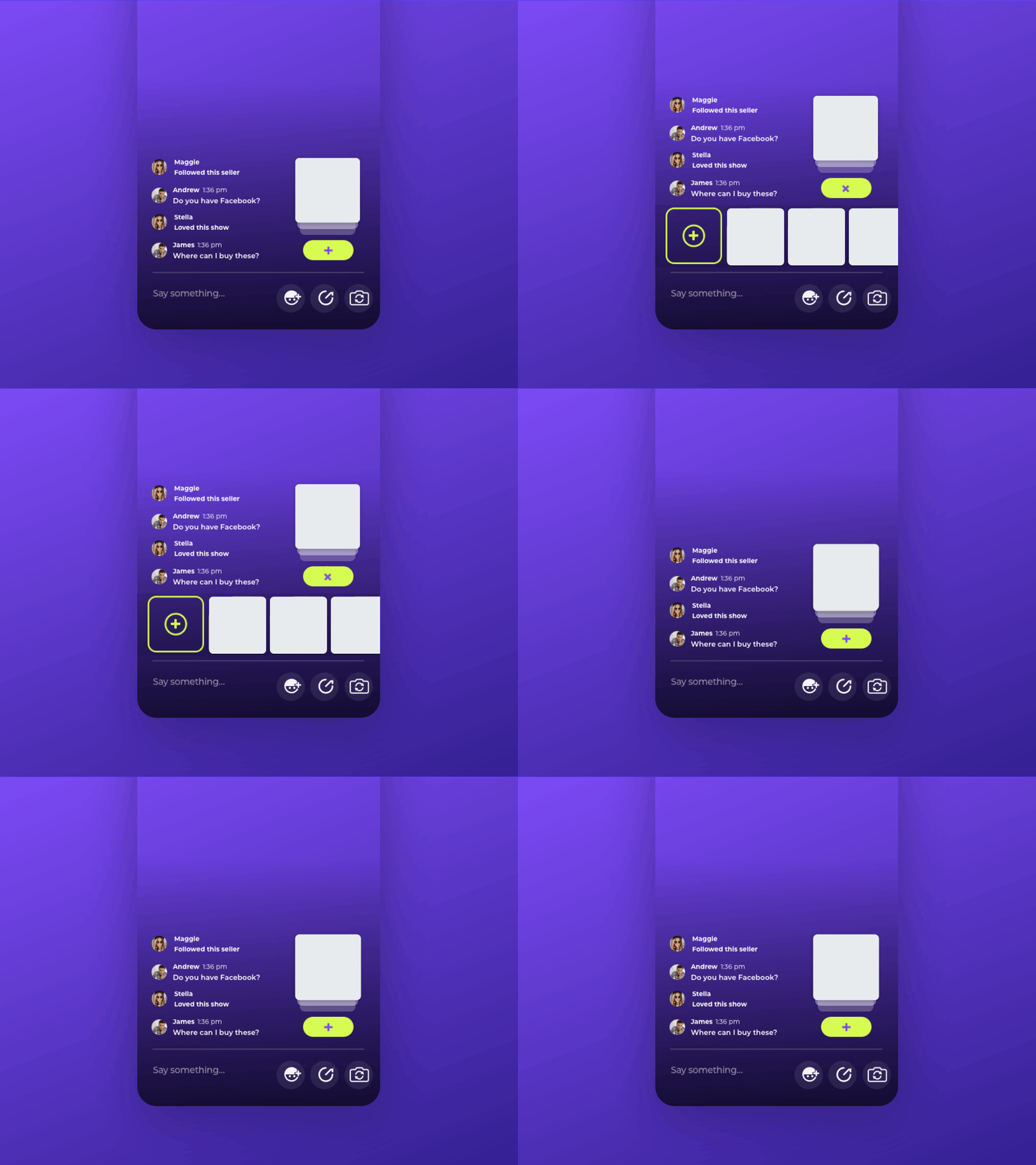
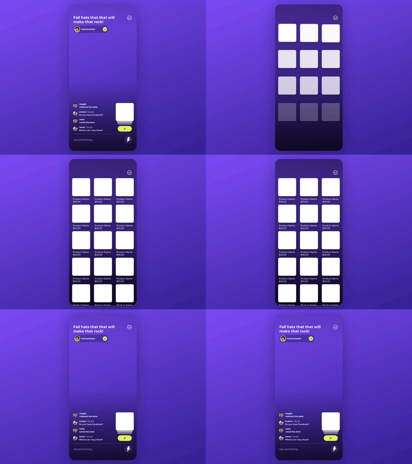
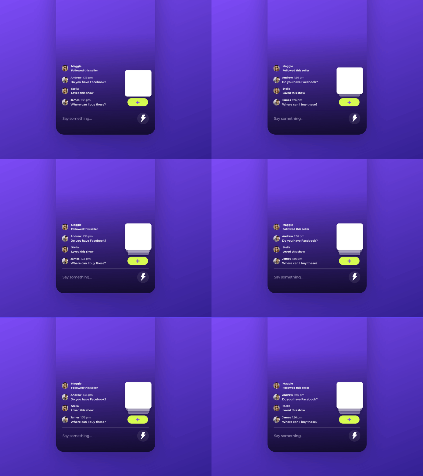
We then focused on the refining interactions to come up with this suite of very quick but smooth transitions to signal to the user about the actions taking place

→
• User needs to know about upcoming shows ✅
• User needs to know what shows are currently live 🚫 (not clear)
• User needs to be able to start a show easily 🚫 (entry point not clear)
• User needs to be able to add products to purchase 🚫 (products get lost in comments)
Draft II (10/2018)
We then needed a way to separate user information vs content I came up with this transition from profile to show live show view to address:
→
• Users own profile information vs store profiles ✅
• Users own shows vs. live and upcoming ✅
• Show preview vs Live show 🚫 (not clear in this version)
Prototype +++ (11/2018)
We prototyped as many parts of the app as we could to make sure the user had an exciting experience while navigating the complexity of an E-commerce, Social Media, and Broadcasting in one application.
• Discovery ✅
• Scheduling, and going live ✅
• Adding payment method ✅
• Live chat ✅
• Sharing products live ✅
• Fulfillment 🚫 (not clear in this version)
Everything falls into place
Now we had a basic experience crafted around the human connection between Buyers and Sellers in the platform.
The following prototype gave our developers good enough guidance for our first build in the App Store.
NOTE: this is 2018 Figma was a not big then, Sketch and Zeplin ruled the land. So in order to achieve these prototypes I had manually build them in html5.
→
→
In order to go live we had yet to address 2 important points of the product:
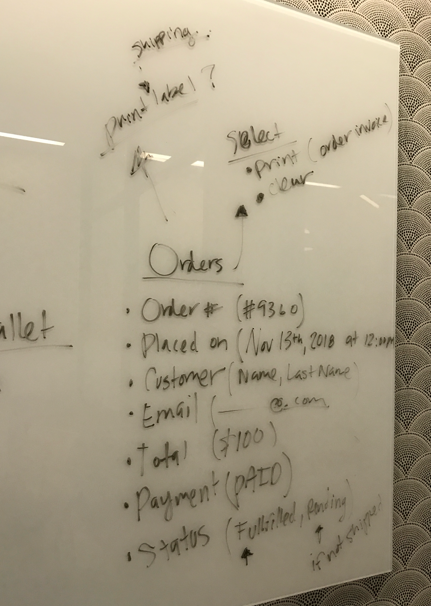
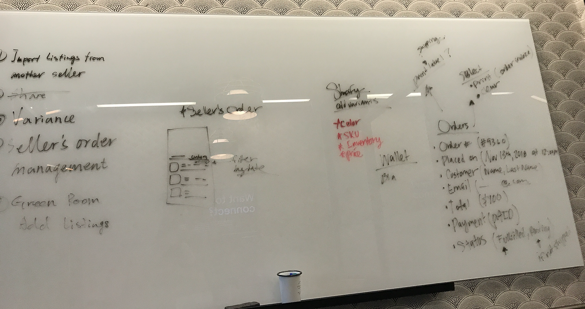
How do users upload inventory?
How do they ship their sold items?
Next Project: Popshop Redesign

