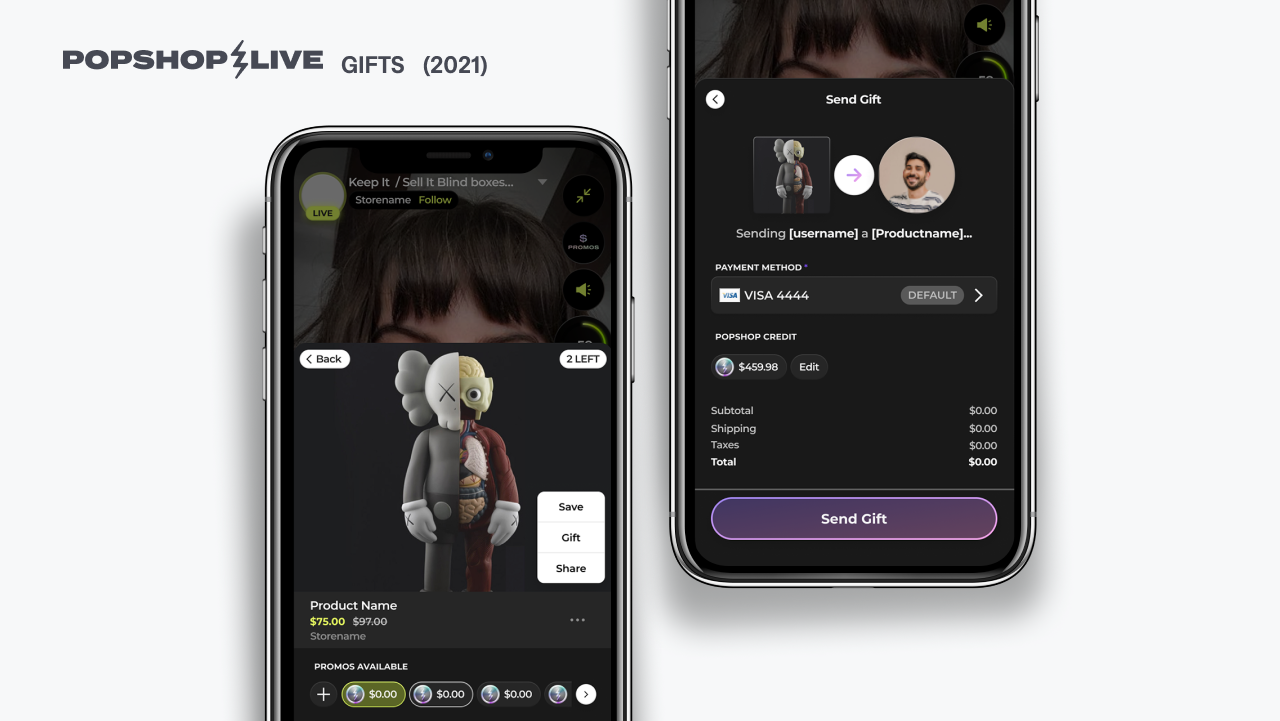
On 2022 we started to get a lot friction from users struggling to perform basic tasks. User started to create guides and videos for their audience to help them through the pains of finding their offerings. which was disrupting our onboarding and becoming really distracting during the shows when people would use the time to trouble shoot their accounts.
On 2019-2020 we started to support web as platform for our shows in order to host events in Popshop, so we had a big portion of our code base merged into a react app output which made a lot of our design decisions to prioritizing deployment versus usability, the release was successful in terms of unlocking a huge potential in hosting conferences and allow shows to be consumed in all types of devices, but this also creating some inevitable consequences for our overall UX.
The below were the mayor pain points we saw the come up often in our Seller Central (discord channel) and our monthly zoom check-ins:
1. I Can't find my show!
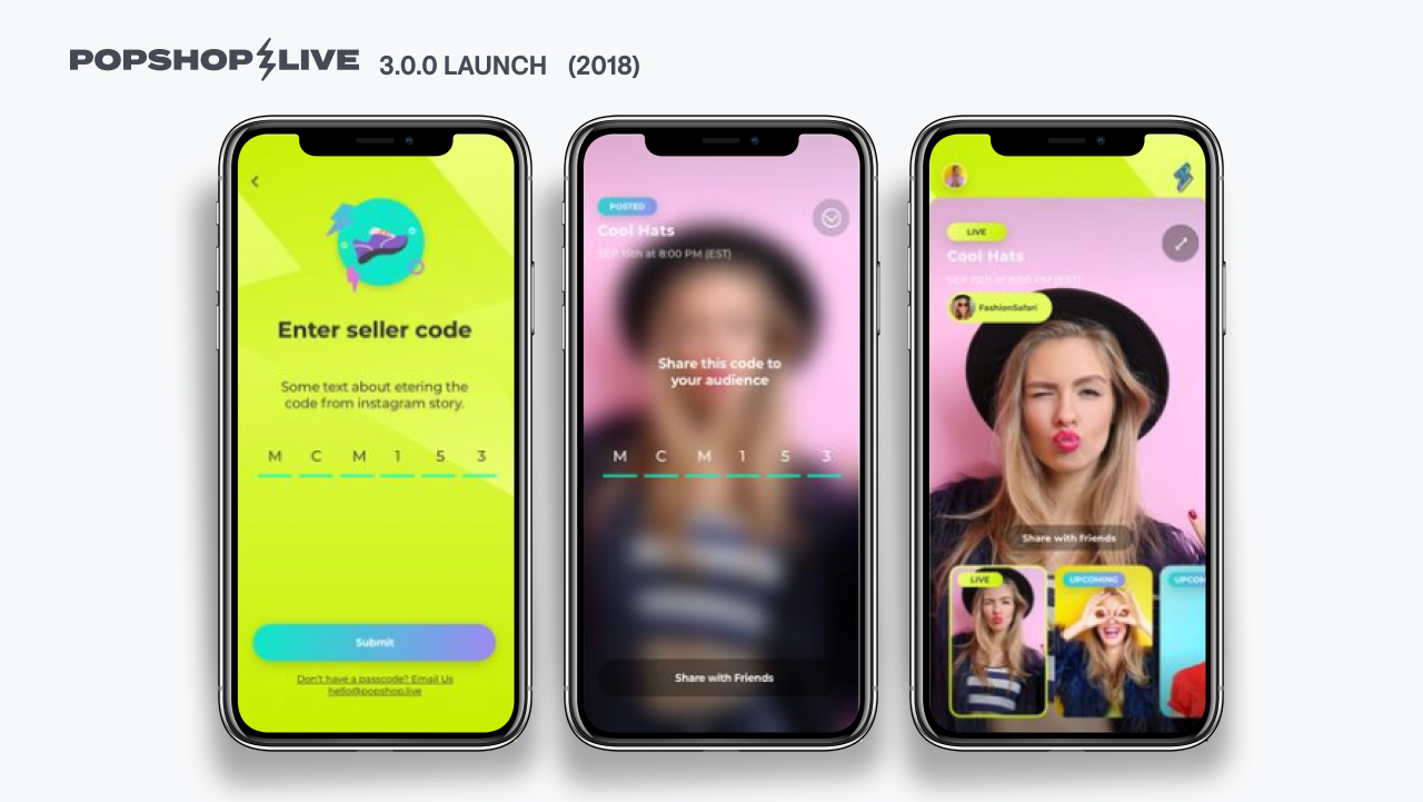
last version of our Home Screen had placed a seller's own show along with regular rows of categories and featured content, then pushed it to a very long scroll position in the Home Screen which our users were not always aware of.
in the redesign we added a fixed navigation bar with a quick access to the users account profile information, there we made very clear and single out the previously scheduled shows and made it easy to start the livestream from the same place.
2. I can't find my friend's show!
User will often get invited to join Popshop by a friend that is hosting a show via referral. this will automatically add the user to the host's follower list and send notifications when the show is about ti start. But, if an invited user wanted to share the show to someone else, your best chance would be for it to be one of our featured shows, otherwise you'd have to look through a long list of future shows to find it.
we updated the search page of our Home Screen and displayed live and upcoming show in the user profile cards along with some other info so the user had everything relate to the account in one place.
3. How do I know what I can shop?
Added a shopping tab to the bottom navigation to have a fixed entry for the items available in Popshop at any given time.
in the past the only access point was hidden under the "See all" arrow in a home page row.
4. How and where do start my show?
In the new profile management page we made it very easy to find all controls for the schedule shows with floating icons fixed on the bottom for quick access to the show settings.

